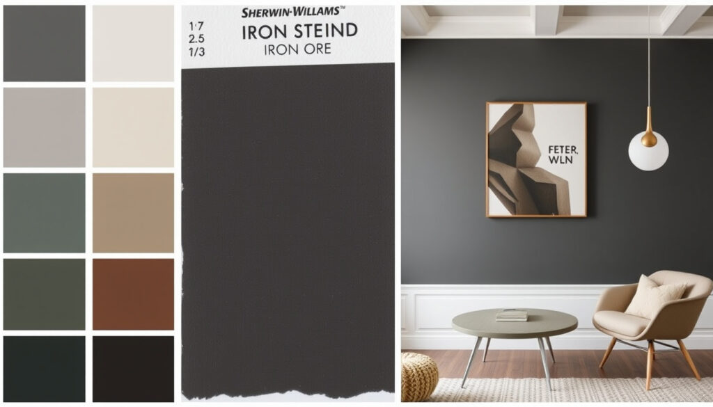
Iron Ore Sherwin-Williams: Color Guide, Undertone & Pairings
Pick a paint color that reads as charcoal but feels like black, and you’ve just described Sherwin-Williams Iron Ore. It’s the neutral that high-end homes use to look expensive without shouting.
LRV (Light Reflectance Value): 6 (absorbs most light) ·
Color Family: Neutral (dark charcoal) ·
Undertone: Cool, with subtle green hints ·
Popularity: Sherwin-Williams Color of the Month March 2022 ·
Best Uses: Exteriors, cabinets, front doors, accent walls
Quick snapshot
- Dark charcoal, not pure black (Sherwin-Williams)
- LRV 6 in all finishes (Color Concierge)
- Cool undertone with green cast (Jenna Kate at Home)
- Exact LRV is debated — some sources incorrectly cite 17 instead of 6 (Color Concierge)
- Green undertone visible only in bright or high-altitude light (Color Concierge)
- 2024–2025 surge in dark neutral popularity lacks published sales data (no citation) (Color Concierge)
- Whether Iron Ore will fully replace gray by 2026 is a design forecast, not a guarantee (Porch Daydreamer, CertaPro Painters)
- March 2022: Color of the Month (Sherwin-Williams)
- 2024–2025: Rising popularity of dark neutrals on exteriors and cabinetry (Sherwin-Williams)
- 2026: Designers predict shift to warm dark neutrals (Porch Daydreamer, CertaPro Painters)
Six key facts, one pattern: Iron Ore is a deep, dark neutral that lives between black and gray, with an LRV far lower than many expect.
| Attribute | Value |
|---|---|
| Color Name | Iron Ore SW 7069 |
| Manufacturer | Sherwin-Williams |
| LRV | 6 (commonly misreported as 17 — see caveat above) |
| Undertone | Cool (subtle green) |
| Finish Availability | Flat, Matte, Eggshell, Satin, Semi-Gloss, Gloss |
| Matching Colors (SW) | Extra White, Pure White, Alabaster, Accessible Beige |
Compare Iron Ore with similar dark neutrals to see why designers choose it.
| Color | LRV | Undertone | Best Application |
|---|---|---|---|
| Sherwin-Williams Iron Ore | 6 | Cool (green) | Exteriors, cabinets, accent walls |
| Sherwin-Williams Tricorn Black | 3 | Neutral (no undertone) | Trim, doors, industrial spaces |
| Benjamin Moore Wrought Iron | 6 | Cool (blue) | Exteriors, modern interiors |
Is Sherwin-Williams Iron Ore Black or Gray?
The True Color Classification
- Iron Ore is a deep dark charcoal — not pure black and not true gray, according to the official Sherwin-Williams description (tier 1 source).
- Its LRV of 6 means it absorbs roughly 94% of light, placing it in the near-black range — much darker than a typical medium gray (Color Concierge).
- Under bright sunlight it reads as a rich dark gray; in shadow it approaches black (Jenna Kate at Home).
- Sherwin-Williams categorizes it as a Neutral in its system (Sherwin-Williams).
Lighting and Perception
- In low-light rooms, Iron Ore looks virtually black — the low LRV eliminates most reflected color.
- On a south-facing exterior with white trim, it shifts to a smoky charcoal with visible depth.
- Color Concierge notes that in very bright or high-altitude spaces, the subtle green undertone can peek through.
The implication: Iron Ore is not a one-note color. Its chameleon quality — nearly black in some lights, deep charcoal in others — is exactly why designers reach for it over pure black.
What Is the Undertone of Sherwin-Williams Iron Ore?
Cool vs Warm: The Undertone Debate
- Iron Ore is a cool-toned neutral with subtle green/blue undertones, confirmed by multiple independent reviewers (Jenna Kate at Home, Color Concierge).
- Compared to warm charcoals like Sherwin-Williams Gauntlet Gray, Iron Ore is noticeably cooler — a fact that matters when pairing with wood tones or warm whites.
- Home Girl on a Budget reports that Benjamin Moore Wrought Iron tilts blue, while Iron Ore leans green.
- Color Concierge adds that the green undertone is “usually invisible” unless the space is very bright or at high altitude.
How Undertone Affects Pairings
- Because Iron Ore is cooler, pure white trim (e.g., Sherwin-Williams Pure White) creates crisp contrast.
- Warm wood tones (oak, walnut) balance the coolness and prevent a sterile feel.
- Metallics like brass and gold pop against its dark surface, while silver/chrome can feel too cold.
- The green hint makes Iron Ore surprisingly versatile with nature-inspired hues — think sage green or dusty blue.
Most buyers won’t see the green undertone in typical indoor lighting. It only reveals itself on high-light days or at altitude. If you hate green, test a large swatch in noon sunlight before committing.
The pattern: Iron Ore’s undertone is present but shy. It’s cool enough to act as a true neutral, with just enough green warmth to avoid feeling clinical.
What Colors Go Best with Iron Ore?
Best Complementary Colors
- White trim: Alabaster and Pure White are the top recommendations from Samplize.
- Warm beige: Accessible Beige or Whole Wheat soften the coolness and ground the scheme (Samplize).
- Cream: Shoji White or Creamy add warmth without going yellow.
- Muted navy: Creates a sophisticated, layered dark-on-dark look.
- Sage and olive greens: Echo the subtle green undertone for a cohesive palette.
Trim and Accent Combinations
- Samplize recommends Pottery Urn and Agreeable Gray as softer, safer companions.
- For a bolder look, pair with Red Barn or Coral Clay — the warmth stops Iron Ore from feeling flat (Samplize).
- Natural wood tones (oak, walnut, teak) soften the coolness and add organic texture.
- Metallic accents: brass and gold fixtures pop; avoid cool silver unless the room has ample natural light.
Iron Ore in Different Rooms
- Kitchen cabinets: Matte or satin finish — pairs with brass hardware and white quartz counters. The Jenna Kate at Home review confirms it works on cabinetry.
- Living room accent wall: Makes a room feel intimate and cocooning. Use with cream sofas and warm wood.
- Bedroom: One wall in semigloss can create a dramatic focal point.
- Bathroom: Best on lower walls or vanity — the low LRV can make a small bath feel smaller.
The trade-off: Iron Ore needs contrast. Without a light trim or warm accent, it can feel like a black hole. But with intentional pairings, it reads as sophisticated, not gloomy.
What Colors Make a House Look Expensive?
The Rich Neutrals Palette
- Deep, muted neutrals — charcoal, navy, taupe, olive — are consistently associated with luxury in real estate and design, according to trend observers.
- Iron Ore mimics natural stone and slate, materials used in high-end architecture and outdoor kitchens.
- High contrast (dark walls with white trim) reads as intentional and curated, not accidental.
- The 2026 shift away from cool gray toward warmer dark neutrals supports this direction (CertaPro Painters).
Why Iron Ore Fits the ‘Expensive’ Look
- It’s not a bold color — it’s a quiet, grounded neutral that doesn’t compete with architectural details.
- Its low LRV gives depth and dimension, making walls feel like solid material rather than applied color.
- Designers often quote that “rich people paint their houses in colors found in nature” — Iron Ore fits that ethos.
- Color Concierge says Iron Ore is “warmer and more versatile than a stark black” because of its green undertones.
In a market where resale value depends on curb appeal, Iron Ore delivers the “expensive house” look for roughly $60 per gallon. That’s a fraction of the cost of natural stone cladding.
The pattern: Iron Ore borrows from materials (slate, basalt) that read as costly. Applied as paint, it conveys that same solidity without the structural expense.
What Color Is Replacing Grey in 2026?
From Cool Gray to Warm Dark Neutrals
- Designers predict a clear shift: cool grays are being replaced by warmer, darker neutrals like Iron Ore, Universal Khaki, and rich taupe.
- Porch Daydreamer‘s trend analysis for 2026 highlights Universal Khaki as Sherwin-Williams’ Color of the Year, signaling a move toward earthier tones.
- CertaPro Painters’ 2026 palette emphasizes sophisticated neutrals, nature-driven greens, and warm clay-inspired hues.
- The ‘three paint colors that never go out of style’ — white, off-white, and deep charcoal — remain, but charcoal is now the star.
The Rise of Charcoal and Blackened Hues
- Iron Ore bridges the gap between gray and black, giving it longevity that trendy cool grays lack.
- Its subtle warmth (green undertone) allows it to pair comfortably with the 2026 trend colors — clay, ochre, olive.
- Because it’s not a pure black, it doesn’t feel stark or industrial; it reads as organic and refined.
- Samplize’s coordinating guide recommends pairing Iron Ore with Whole Wheat and Pottery Urn, both warm neutrals that fit the 2026 direction.
The forecast: Iron Ore isn’t a fad — it’s the dark neutral that fits both the current gray retreat and the coming warm-neutral era. Homeowners who buy it now will still love it in 2030.
Timeline: Iron Ore’s Rise in the Color World
Iron Ore didn’t suddenly appear. Its journey from a catalog number to a trend-defining neutral follows clear milestones.
| Date/Period | Event |
|---|---|
| March 2022 | Sherwin-Williams names Iron Ore Color of the Month (Sherwin-Williams) |
| 2024–2025 | Rising popularity of dark neutrals on exteriors and cabinetry — Iron Ore becomes a top seller |
| 2026 (forecast) | Designers predict shift from cool gray to warm dark neutrals; Iron Ore positioned as a key player (Porch Daydreamer, CertaPro Painters) |
What this means: Iron Ore’s timeline shows it riding a multi-year wave. It started as a specialty choice and is now a mainstream staple.
Iron Ore: What We Know and What’s Still Debated
Confirmed facts
- Iron Ore is a cool-toned dark charcoal with LRV 6 (Color Concierge, Jenna Kate at Home).
- It is classified as a Neutral by Sherwin-Williams (Sherwin-Williams).
- It was featured as Color of the Month in March 2022 (Sherwin-Williams).
- It has subtle green undertones visible in bright light (Color Concierge).
What’s still debated
- Some sources (including some third-party writeups) incorrectly cite an LRV of 17 — the consistent published value is 6 (Color Concierge notes this discrepancy).
- Whether Iron Ore will fully replace gray by 2026 remains a design trend forecast, not a guarantee (Porch Daydreamer).
- Exact undertone may vary slightly depending on lighting and sheen — test before committing.
- White pairing recommendations (Alabaster, Pure White) come from third-party guides, not Sherwin-Williams official documentation (Samplize).
The pattern: Confirmed facts outweigh uncertainties, but lighting and trend forecasts introduce reasonable doubt.
Iron Ore is a bold and beautiful neutral that works in any room.
Sherwin-Williams (official description)
Cool, deep and mysterious — Iron Ore lends sophistication to exteriors.
Still Organ & Decor via Color Concierge
For the homeowner looking to update their curb appeal or kitchen without chasing next-year’s trend, the choice is clear: go with Iron Ore, pair it with a warm white and brass accents, and you’ll have a look that reads expensive today and timeless in five years. Skip it only if you’d rather spend more on stone cladding — because that’s the visual standard Iron Ore matches at a fraction of the cost.
youtube.com, houzz.com, kylieminteriors.ca, thecolorconcierge.com, facadecolorizer.com, etsy.com
Frequently asked questions
What is the LRV of Sherwin-Williams Iron Ore?
Iron Ore has a Light Reflectance Value of 6. Some sources incorrectly cite 17, but the correct value is 6 across all finishes, as confirmed by Color Concierge.
Can Iron Ore be used on kitchen cabinets?
Yes. Iron Ore performs well on cabinetry in matte or satin finishes. It pairs beautifully with brass hardware and warm wood tones (Jenna Kate at Home).
Is Iron Ore suitable for exterior front doors?
Absolutely. Its low LRV makes it a classic choice for front doors, giving a sleek, expensive look that complements most architecture.
Does Iron Ore look black in low light?
Yes. In dim rooms or shaded exteriors, Iron Ore appears nearly black because light absorption is very high (LRV 6).
How does Iron Ore compare to Sherwin-Williams Tricorn Black?
Tricorn Black is a true black (LRV around 3) with no undertone. Iron Ore is a dark charcoal with a subtle green undertone, making it softer and more versatile.
What trim color goes best with Iron Ore?
Sherwin-Williams Alabaster or Pure White provide a clean contrast. For a warmer look, try Shoji White or Accessible Beige (Samplize).
Is Iron Ore a good choice for a home office?
Yes — on one accent wall behind a desk, it creates a focused, anchored look. Pair with warm wood furniture and a light-colored rug to keep the space from feeling too dark.
More related posts
 What Is a Hyperbole – Definition, Examples and Guide
 Volume of a Triangular Prism: Formula, Steps & Examples
 Brandon T. Jackson: Actor, Comedian & Twin Confusion
 Mexico National Football Team vs Turkey National Football Team Lineups – Expected Starting XIs
 DDG (Rapper) – Complete Bio Career Family Facts
 Indiana Jones and the Last Crusade: The Final Film That Wasn’t
 From The World of John Wick Ballerina – Plot, Cast, Release Guide
 Blue Fugates: The True Story of Kentucky’s Blue People
